Blog

The blog of Toronto design firm Cynthia Ferguson Designs.

4 Tips for Downsizing in Style

I have had so much amazing feedback about the room I designed that was recently featured in The Globe and Mail! It was part of a condo that I designed for an favourite client who certainly was not afraid of colour!

I design a lot of condos here in Toronto, and that market is under great pressure, especially in urban centres like mine. With real estate prices at all-time highs, condos are the solution for first-time homeowners as freestanding homes are out of reach. At the same time, we have the start of the baby boomers moving out of the family homes and downsizing into condos. It is a unique situation where two age groups are after the same real estate product. I’m often downsizing clients from homes that are over 4,000 square feet to 1,500 square feet! Downsizing is a puzzle only the brave take on, but here are my top tips for making that move seamlessly and in style!!

Cynthia Ferguson Designs

Cynthia Ferguson Designs

Recognize the emotion of the move

Most people who are downsizing and moving into condos are seniors, and this can be an emotional change for them. Selling the family home is always a difficult decision to make. Sometimes an illness of one of the parents forces the timing of the move. Sometimes the family home doesn't make sense because it is a lot to keep up. Editing the family's furniture collection can also be very difficult as there are so many memories attached to each piece. That is where we come in! Our firm is a great sounding board for practicality. We start with explaining the limitations of a condo and some of the issues that might arise. The more informed a client is, the more their expectations are managed, the easier the transition is for them.

Cynthia Ferguson Designs

Cynthia Ferguson Designs

Edit, edit, edit.

This is really THE key to making a downsizing move work. The first step is to learn which pieces are non-negotiable. We always keep the key pieces that our clients simply could not part with to start and then we offer other pieces that will not fit to family members first, followed by vintage shops for resale. We always hang on to the pieces that are emotionally most important for the client or the family. It is about emotional attachment, not practicality when downsizing. We find our clients like to keep their dining sets and to us, keeping the table that creates family memories is imperative, so then we need to deal with how that effects the living spaces.

Cynthia Ferguson Designs

Cynthia Ferguson Designs

Learn to mix it up.

The next step is to start mixing in newer pieces. They should stand out and make a statement amongst the antiques and older items. Antiques or vintage pieces give a space credibility. They show history. They share memories. New pieces liven up the space by providing contrast. Use them for a pop of colour, or to add a new softer edge on a table or to act like art in a space - like Tommy Mitchell's accent table with butterflies under Lucite!

Cynthia Ferguson Designs

Cynthia Ferguson Designs

Colour your world.

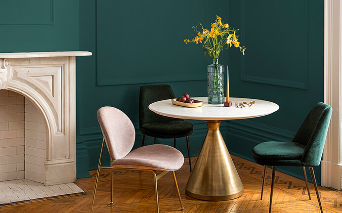
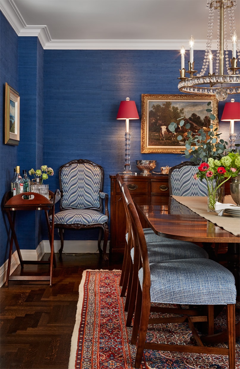
Often our clients like to add new pieces into their new space and we find they are more apt to select lots and lots of colour! As our clients age, their eyesight starts to fade, so we always layer in lots of lighting and lots of bright colours. We have used hot pink grasscloth wallpaper, bright orange velvet trim, and bright green lampshades!  Colour makes a big impact in smaller spaces, so go for it!

Cynthia Ferguson Designs

Cynthia Ferguson Designs

Use these tips to help downsize your space while updating your style quotient!

Until next time,

-Cynthia

Design Inspiration: Water Colours

The holidays are such an incredible time to recharge and relax - especially if you can get away! One of my favourite destinations is a series of remote islands in the Caribbean. The calm, the gorgeous views - it’s the best place to spend the holidays! And who wouldn’t be inspired by these gorgeous sky and water colours?

Photo by Cynthia Ferguson

Photo by Cynthia Ferguson

The gorgeous blues and greens find their way into so many of the rooms I design! I’m not the only one who loves this palette - the colors are soothing and calming, perfect for a gorgeous interiors! They bring a little bit of your vacation home, even in the dark winter months!

Cynthia Ferguson Designs

Cynthia Ferguson Designs

Rolling waves are incredibly soothing on these isolated beaches. You can see why I keep returning with my family for every holiday!

Photo by Cynthia Ferguson

Photo by Cynthia Ferguson

I created that feeling of movement and water with a pattern of tiles in the backsplash of this kitchen I designed!

Cynthia Ferguson Designs

Cynthia Ferguson Designs

Even this gorgeous seating area in the middle of nowhere can be recreated in a formal dining room with the right colours and patterns.

Photo by Cynthia Ferguson

Photo by Cynthia Ferguson

I used breezy drapery in a cool turquoise colour to provide that idea of calm and serenity in this Toronto dining room. It’s like a tiny moment of the islands in the middle of a snowy, busy city!

Cynthia Ferguson Designs

Cynthia Ferguson Designs

I love bringing these inspirational moments and colours home with me - where do YOU find your inspiration?!

Until next time,

-Cynthia

A Shiny New Year

Metals and metallic looks are key to fabulous interiors - I think they’re just as important as the other colours in the room! Metals can be used to enhance the palette, or as a great counterpoint. Let’s take a look at how I use metals in my designs!

Cynthia Ferguson Designs

Cynthia Ferguson Designs

Enhance and Coordinate

I like to use metallic finishes to coordinate with the decor, like you see above. The gold frame brings out the gorgeous colour in the chair’s fabric, and even adds more warmth to the walls.

Cynthia Ferguson Designs

Cynthia Ferguson Designs

In the cool white kitchen above, I used silver nickel looks to almost blend into the background. It keeps the look calm and collected!

Cynthia Ferguson Designs

Cynthia Ferguson Designs

Bold Statements

Sometimes you want a bolder look, and that’s when I use a metallic finish to add some drama! In the bedroom above, the gold colour in the light fixture really pops against the blue wall covering. It’s a gorgeous counterpoint!

Cynthia Ferguson Designs

Cynthia Ferguson Designs

I got the same effect above when I placed the gold leaf mirror on a metallic finished wallpaper. The contrast between the two draws the eye to the mirror and adds a little wow factor to this small space!

Cynthia Ferguson Designs

Cynthia Ferguson Designs

Mixing It Up

Can you mix metals? YES! I love combining finishes for a fresh look, like in the bathroom I designed above. The nickel fixture is a great complement for the marble, while the gold-colored hardware really pops on the navy cabinetry. Together, it creates a unique and polished design!

Cynthia Ferguson Designs

Cynthia Ferguson Designs

Speaking of mixing things up, don’t forget about matte black finishes - they’re going to be HOT in 2019! And look at the drama this bold black chandelier brings in a bathroom I designed - love that piece from Kelly Wearstler!

Ring in a shiny new year by experimenting with the metal finishes in your home!

Happy New Year!

-Cynthia

The Colour of the Season

Every year, paint companies and colour trend forecasters make their predictions for what the Colour of the Year will be in the coming months. Behr says it will be an “uplifiting blue,” Benjamin Moore selected a neutral gray, Sherwin-Williams says it will be a terra cotta colour, and Pantone went bold with a bright coral. But I’m leaning toward the selection by PPG called Night Watch.

PPG’s Night Watch

PPG’s Night Watch

This is a rich and classic green that I think more people will want to use in their homes. In times of uncertainty, a calming colour always becomes more popular. Plus, green is always listed as the second most popular colour for people, just behind blue. I’ve noticed that I’ve been using it more in my own projects, too!

Selections for one of my projects

Selections for one of my projects

Interior designers are always the first to use the latest colours or to spot new ideas before they become trends. As you can see above, I was already starting to gravitate toward deep greens all the way back in July.

A green door in Nantucket

A green door in Nantucket

In fact, looking back through my travel photos from 2018, I can see how inspired I was by this deep green colour - in art, in fashion, and even on a door!

Screen Shot 2018-12-19 at 8.56.26 AM.png

I was stopped in my tracks by the incredible green-glazed pottery in Sarah Bartholomew’s Nashville store!

Screen Shot 2018-12-19 at 8.58.26 AM.png

I started specifying even more than usual from this part of the colour chart, as you can see above. So many gorgeous greens to choose from!

Cynthia Ferguson Designs for Alden Parkes

Cynthia Ferguson Designs for Alden Parkes

As an early adopter, I’m using these green hues more and more now, like I did above for Alden Parkes. How gorgeous is that Kelly Wearstler fabric for Kravet??

Designers are always early adopters, and working as much as I do with colour I know I’m on the write track. I’m looking forward to 2019 being the Year of Green!

Until next time,

-Cynthia

Find Your Last-Minute Holiday Gifts!

My clients love when I curate their accessories and decor, finding just the right piece for every room in their homes. In fact, a good part of my job is spent shopping, which I love! And now you can find some of my best finds on my own online shop here!

Cynthia Ferguson Designs

Cynthia Ferguson Designs

Opened just a few weeks ago, the shop includes accessories, pillows, tabletop, and of course fabulous holiday decor! One of the most popular things on the shop has been a collection of felted animals and figures - I love them so much that I wanted everyone to be able to have one (or more!).

A felted reindeer from Cynthia Ferguson Designs

A felted reindeer from Cynthia Ferguson Designs

I’m especially fond of the little gnomes with their overgrown beards and huge hats! They make great last-minute gifts and stocking stuffers!

Scandinavian Large Gnome from Cynthia Ferguson Designs

Scandinavian Large Gnome from Cynthia Ferguson Designs

I’m also asked all the time for recommendations on great home decor - so of course I included my favorite pillows, chambray table linens, and glass hurricanes.

Cut Velvet Striped Pillow from Cynthia Ferguson Designs

Cut Velvet Striped Pillow from Cynthia Ferguson Designs

The shop is curated to showcase my love of colour, collections, and whimsy! Drop in to finish up your holiday shopping, and let me know which items are your faves!

Until next time,

-Cynthia

4 Tips for Setting Your Holiday Table

I absolutely love having family and friends visit during the holidays! Planning those dinner parties and get-togethers are half the fun for me, but I know some people find it to be stressful. The key is to not try to make everything perfect, but to enjoy every moment! So I’ve put together 4 of my best tips to set a stress-free - and gorgeous! - holiday table:

Cynthia Ferguson Designs

Cynthia Ferguson Designs

Mix high and low

I like to use three categories of items on my tables: current, vintage, and precious. Current could be something you picked up at a store that isn’t necessarily expensive, but you love it! Vintage could be china you inherited from your grandmother, or a great piece of silver you found at an antique store. And precious - well that’s something that holds more sentimental value than monetary value. Then it’s all layered on the table; it makes the look approachable, but still special!!

Cynthia Ferguson Designs

Cynthia Ferguson Designs

Fresh flowers

Always have fresh flowers or greenery on the table. It could be a bouquet professionally done, or a bunch of seasonal flowers from your local market, or even fresh-cut greenery. If budget is tight, spread the bunch of flowers out by using single bud vases lined down the middle of the table for greater visual impact!

Cynthia Ferguson Designs

Cynthia Ferguson Designs

Make it personal

If it’s a family gathering, use some vintage pieces passed down to you. If it’s a bunch of friends gathering, make simple place cards, tie ribbon to the back of each chair, and thread the place card through the ribbon

One of my own collections!

One of my own collections!

Use your collections

There is nothing better than a collection. Maybe it’s a collection of salt and pepper shakers. Maybe a collection of monogrammed napkin. Perhaps a collection of mini nutcrackers. Use your collections to make your table about you and your personality. People are gathering around your table because they want to spend time with you. Show them a little about you through your collections. Don’t have a collection? Start on by searching on Etsy or going to your local thrift store. Start with what speaks to you and go from there!

Use these tips to create new memories this holiday season - and remember to have FUN!!

Until next time,

-Cynthia

Design Inspiration: The Art World

To stay creative and at the top of my game, I love to find inspiration in colour, shape, pattern, and textures. And the one place that fills up my creative tank fastest is an art gallery or museum! I’m fascinated by paintings, sculptures, drawings - every part of the art world inspires me!

Screen Shot 2018-09-18 at 10.08.08 AM.png

There is something incredible about art - the conversation it initiates, the emotion it generates, the memories it calls up....and then there is the discussion about the artist. What were they thinking and feeling when they first took brush to canvas. What were they trying to communicate? Am I experiencing their piece in the way that was intended?

I was absolutely obsessed with the art in a hotel I stayed at earlier this year, like the piece above! I drove the staff crazy as I appeared at their desk every day with a new inquiry about the piece I saw here and the piece I saw there and their sconces and their desk chair....it went on and on! Let’s just say I seemed to have had a taxi to the airport a lot faster than everyone else oddly.

Screen Shot 2018-09-18 at 10.22.50 AM.png

I loved the texture and pattern play on this magnificent wall! The art installation was so stunning that I had to remind myself to keep my hands in my pockets so I wouldn’t touch it! But wouldn’t this be magnificent in a client’s home?!

I am inspired to get my paints out again after seeing this gorgeous piece! Look at these incredible stripes and colours!! This installation from Sean Scully can be enjoyed near Mexico City at Cuadra San Cristobal 

Sometimes it just takes one piece of art to capture your interest in a space and make it sing! This artist Gordon Shadrach is from Toronto, and his paintings stop you in your tracks you as you walk into a room!

Screen Shot 2018-09-18 at 10.08.25 AM.png

Keep your eyes open, because you never know where you’ll spy amazing art! This incredible mural was painted in the parking lot of a restaurant and I was mesmerized! Look at all the patterns the artist incorporated!

Art is so personal. So individual. Remember to get out to your local gallery more often and start a conversation. Stir your emotions. Enjoy the experience!

Until next time,

-Cynthia

Putting Colour in the Kitchen
Cynthia Ferguson Designs

Cynthia Ferguson Designs

If you pay attention to trends in the home, you’ve probably noticed the movement away from all-white kitchens to more colour in the kitchen! I love colour, so this is a trend that I embrace completely! But I also understand that some people are nervous about using bright hues in their home, so here are steps to help you get into the colour groove!

Cynthia Ferguson Designs

Cynthia Ferguson Designs

If you’re not sure about making a big commitment to colour, try adding just a touch of something bright, like these bold red stools I used in a condo kitchen. It’s a great pop of colour, but can easily be changed out as your taste changes!

Cynthia Ferguson Designs

Cynthia Ferguson Designs

If you’re feeling a little bolder, start with a cream colour rather than white and complement it with lovely purpley shades! This creamy colour is warm and inviting, and much less stark than white. It’s the perfect palette for cooking up something delicious!

Cynthia Ferguson Designs

Cynthia Ferguson Designs

If you’re ready to embrace the rainbow, it’s best to start with a colour you love. Blue is regularly rated as the world’s favourite colour, and for good reason. It’s a calming, soothing tone that has been proven to spark creativity! It’s easier to be surrounded by colour if it’s one that makes you happy, so keep that in mind as you choose your kitchen palette.

So are YOU ready to embrace colour in the kitchen?! Tell me why (or why not) in the comments!

Until next time,

-Cynthia

Creating a Room from Scratch

When I was asked to design a vignette for Rooms with a View at Southport Congregational Church in Connecticut, I was thrilled! It’s a showcase for charity and for the interior designers who are invited to participate - and it isn’t as easy as it sounds. We each had a 6’ x 8’ room - a small box really - that we needed to transform into a WOW moment!

Cynthia Ferguson Designs

Cynthia Ferguson Designs

I treated it like any room I design, and started with a sketch. I wanted a cozy breakfast room that would be perfect for gathering with family during the upcoming holidays! To create the coziness, I wanted to use warm colours and fabulous textures!

Screen Shot 2018-11-13 at 9.22.15 AM.png

As you can see above, we really did start with a box. That tiny-looking space needed to be transformed - and quickly - into a showstopper!

Screen Shot 2018-11-13 at 9.22.41 AM.png

The gorgeous Farrow & Ball colours were the first thing we put into our space - where I used a deep moody hue on the walls and a lovely blush-like colour on the ceiling! You can also see that the sconces are in place and the furniture has all been delivered at this point!

Cynthia Ferguson Designs for Rooms with a View

Cynthia Ferguson Designs for Rooms with a View

Finally, the big reveal - and I couldn’t have been happier with how it turned out! The warm colours, fabulous fabrics, and layered accessories definitely created that cozy effect that I was going for!

Cynthia Ferguson Designs

Cynthia Ferguson Designs

The glow in the room is enhanced by this gorgeous fixture from Circa Lighting and the light reflected off of that lacquered ceiling featuring a colour from Farrow & Ball that’s never been used in a showhouse before!

IMG_1902.jpg

I was lucky enough to travel to North Carolina as I was planning my vignette, visiting Replacements Ltd. to select the tabletop I wanted to use!

You can see my final selections of stunning tableware from Replacements here on the breakfast table. I can’t tell you how much it means to have partners and sponsors for events like this! I also worked with Lee Jofa, Acquisitions, and Kravet to create this space.

So what do you think about my cozy little breakfast nook and the design process? Let me know in the comments section!

Until next time,

-Cynthia

How to Artfully Display Your Collections

Collections are a part of our family history. They are a part of our history as a society. I love to collect vintage pressed, for example! I also have a lot of clients who have gathered collections, but they’re often at a loss for how to show them off in their homes. So here are some tips you can use to artfully display what you love:

First, don’t hide them! There’s nothing worse than seeing a group of favorite things hiding in the back of a cupboard or a closet, just because you didn’t know what to do with them. Collections help show your personality - so bring them out front-and-center, like these sweet owls in a Nantucket store window! I love how some are facing in and those near the window are looking out!

Screen Shot 2018-09-18 at 10.47.26 AM.png

Second, see if you can create a pattern with your collections. That makes it easier to display them on a wall or table, like the gorgeous pottery group I saw on a wall in Sarah Bartholomew’s Nashville design store! This is a great way to showcase a collection of plates, bowls, baskets, hats, and so many other cool things!

Screen Shot 2018-09-18 at 10.37.36 AM.png

Third, whenever possible, group similar things together for greater impact. I like to put my collections of pressed glass in small groups by colour or shape - it looks more organized and artful!

47.jpg

Finally, the holidays are the perfect time to pull out your collections - they’re full of memories and nostalgia, which we all love this time of year. These little knitted guys always make me smile!

No matter what you collect, use these tips to create vignettes that will tell a story in your home of who you are!

Until next time,

-Cynthia

Design Inspiration: Checking Out Hotels

I have been traveling almost non-stop for weeks, and while I’m thrilled to be home this weekend, I also love staying in unique and gorgeous boutique hotels around the world! I get so much inspiration from the design of the lobby, the rooms, and even the outdoor areas!

An original installation in a hotel in the Bahamas

An original installation in a hotel in the Bahamas

A colour combination like the purples and blues in the hotel above can spark a new idea for a client’s home, too!

Firmdale Hotel, London

Firmdale Hotel, London

Kit Kemp is a designer who knows her way around patterns and bold colour, so when a client sent me the photo above of the Kemp-designed Firmdale Hotel as an inspiration shot for her home, I knew we were going to get along famously!

Chicago hotel

Chicago hotel

This incredible historic hotel in Chicago had me looking up - WAY up - for a gorgeous classic design. The timeless details here are endlessly fascinating to me!

Beverly Hills Hilton

Beverly Hills Hilton

When I stayed at the Beverly Hills Hilton earlier this year, I was obsessed with the living garden wall in the Wilshire Garden! I want to create one like this for my clients - or maybe just for me!

The Plymouth Miami

The Plymouth Miami

And I am DYING to create outdoor cabanas for a client’s pool area! There’s nothing chicer than a hidden spot with fabrics blowing in the breeze!

Really, inspiration like this is one of the biggest reasons that I love to travel! What are some of your favorite destinations? Let me know!

Until next time,

-Cynthia

How to Have a Haute Halloween

Next week is Halloween! If you want to celebrate the fun of the day but you don’t have little kiddos, there are still so many options for getting a little spooky while staying on the more chic side of the spectrum! Here are some of my faves:

Table design by Cynthia Fergusion

Table design by Cynthia Fergusion

I found these amazing skull plates at TJX, the flatware at Crate & Barrel, and the platter at Home Sense, proving you don’t have to spend a fortune to get a gorgeous look! The black-and-gold palette gives this outdoor table a lot of drama, without a lot of kitsch.

Hudson Grace

Hudson Grace

This feather art from Hudson Grace adds intrigue and a tiny bit of spookiness, but looks incredibly chic!

Pumpkin by Hot Skwash (isn’t that the best name?!)

Pumpkin by Hot Skwash (isn’t that the best name?!)

I was at a jewelry store when I saw this fab silky pumpkin. It reminds me of one of my favorite companies, Hot Skwash! They offer beautiful pumpkins like this that will give you a luxe look for your Halloween decor.

Table design by Cynthia Ferguson

Table design by Cynthia Ferguson

And here’s a look at a dinner party I had last year at Halloween. With lots of candles, a spooky palette, and just a touch of faux webs, I created a Halloween mood that was hip and haute. 

Try these ideas to take your decor from silly to seriously sophisticated!

Until next time,

-Cynthia

Creating a Showhouse Inside a Showroom

I was so excited to be asked to participate in a HUGE project at High Point Market this week! The Market is like Fashion Week for home furnishings – it’s the largest trade show in the world for furniture. Alden Parkes, one of the exhibitors, asked 7 design teams (including me!) to create an actual showhouse in their showroom at Market. Each of us was assigned several rooms and a theme – mine was Modern Glamour.

My moodboard for one of the spaces in the Showhouse in a Showroom

My moodboard for one of the spaces in the Showhouse in a Showroom

Using Alden Parkes’ furniture, we were tasked to create any look we wanted! We also were able to choose products from major sponsors like Replacements, Eastern Accents, and Capa Rugs. You can see my mood board above, and an initial sketch below!

Cynthia Ferguson Designs

Cynthia Ferguson Designs

I was also SOOO lucky to have sponsors in my own spaces, including Lee Jofa, Hot Skwash, Kravet, Kayce Hughes, Hot Skwash, and Circa Lighting.

Cynthia Ferguson for Alden Parkes

Cynthia Ferguson for Alden Parkes

The final result was a colorful and sophisticated space that was so much fun to put together! I think it says Modern Glamour, don’t you? And wait until I show you the rooms by the other interior designers!

Cynthia Ferguson for Alden Parkes

Cynthia Ferguson for Alden Parkes

Thank you SO much to Alden Parkes for giving me such an amazing opportunity – I had a blast!

Until next time,

-Cynthia

4 Tips for a Better Bedside Manner

Whether you have a lot of overnight guests, or you just want to create a better oasis in your own bedroom, there is an art to creating a bedroom that will send you off to dreamland! I’ve designed literally hundreds of bedrooms, and here are my 4 tips that work every time:

Cynthia Ferguson Designs

Cynthia Ferguson Designs

1. Create Calm.

Did you know that your blood pressure will actually go down by looking at the colour blue?! It’s true, and that’s why it’s such a fabulous colour to use in a bedroom, like the one I designed above. Use the most calming colours you can, like white, gray, pale green. And create a little oasis by adding flowers, books, and maybe even a candle to the bedside table. Whatever makes you feel happy and relaxed!

Presentation1.jpg

2. Layer the Light.

When interior designers like me use this term, we’re talking about having a lot of light sources in a room, from bright to quiet. Bedside lights – like this amazing sconce I saw in a hotel in the Bahamas – give you just enough light to read, but not enough to make the room too bright.

Cynthia Ferguson Designs

Cynthia Ferguson Designs

3. Invest in the Best.

There are 2 things that are so important to invest in when it comes to a bedroom: your mattress and your linens. You will spend one-third of your entire life in bed, so you’d better be comfortable while you’re there! How the mattress feels is entirely up to your body type and your sleeping style, so be sure you test-drive as many as you can in the store. And get the linens that feel the way you want them to! For example, if you get too warm when you sleep, then be sure you go for natural fibers like bamboo, silk, and cotton to keep you cool.

Cynthia Ferguson Designs

Cynthia Ferguson Designs

4. Block It

Most everyone sleeps better if you can block a lot of the light in the room. I like to use light-blocking draperies floor to ceiling to really get the room as dark as possible in the evenings.

Try these tips to create welcoming rooms for your guests, and to help you create a quiet respite from your stressful day!

Until next time,

-Cynthia

Lighting Up!

It’s Thanksgiving weekend here in Canada, a sign that we’re definitely close to winter and the holiday season. That also means shorter days and longer nights – a time when the lighting in your house becomes even more important! I love finding new and exciting light options for my clients. Here are a few of the top trends in lighting today:

Schoolhouse light, interior design by Cynthia Ferguson

Schoolhouse light, interior design by Cynthia Ferguson

Matte Black. Deep, dark black is a big trend in Europe and it’s starting to appear in homes here! I love the impact it makes when it’s paired with metal, like in this bedside lamp from Schoolhouse that I used in a boy’s room.

Ridgely Studio Works that looks more like an installation than a sconce!

Ridgely Studio Works that looks more like an installation than a sconce!

Free-Form Lights. Sculptural designs are taking lighting to a more artful place! I recently worked on a custom commission with Ridgely Studio Works that looks more like an installation than a sconce.

Kelly Wearstler chandelier, interior design by Cynthia Ferguson

Kelly Wearstler chandelier, interior design by Cynthia Ferguson

Wow-Worthy Chandeliers. This Kelly Wearstler design I used in a master bathroom takes the starburst or Sputnik design to a whole new level! Designed in that oh-so-trendy black, the chandelier adds drama to the decor.

Le Deun Luminaires

Le Deun Luminaires

LED Lights. LED has been a major trend for lighting manufacturers for a while, but only recently have they made them look as gorgeous as they are efficient! I’m so in love with these gorgeous gold rings from the French company Le Deun Luminaires!

Get Lit

Get Lit

Traditional Shapes. In table lamps, traditional shapes like the ginger jar you see here from Get Lit are coming back in a big way. The green colour definitely speaks to me, too!

Primavera

Primavera

Bold Color. Speaking of colour, bright pops of colour are being featured not just on the lamps bases, but also on the shades, as you can see in these pretty designs from Primavera. 

Use these ideas to light up your fall and winter days! And if you’re here in Canada, I wish you and your family a very happy Thanksgiving!

Until next time,

-Cynthia

Designer Inspiration: Dining and Decor

Next week it’s Thanksgiving here in Canada – a time to gather with friends and family over a fabulous feast and a gorgeous table! I love to design not only a gorgeous room, but also a great tablescape for my guests and I pull inspiration from so many sources. As I travel, I get a lot of great ideas from restaurants around the world – for colours, design ideas, or for table settings!

This restaurant in Majorca has me dreaming of a non-traditional Thanksgiving tablescape!

This restaurant in Majorca has me dreaming of a non-traditional Thanksgiving tablescape!

For example, a recent trip to Majorca has me thinking about gorgeous cobalt glassware and plates for a more non-traditional Thanksgiving table! Can I just say that the lavender planted near our table also was a heavenly experience? Maybe I should add a few springs to my centerpiece!

A restaurant in Denmark designed by Vernon Panton.

A restaurant in Denmark designed by Vernon Panton.

Speaking of non-traditional colours, I’m crazy for this mix of purples, blues, and oranges in a restaurant in Denmark, designed by Vernon Panton! The lighting and that incredible ceiling installation are inspiring some ideas not only for a party at my house, but also a design I’m cooking up for my client’s dining room.

A private dining room at Cecconi's in West Hollywood, featuring a Damien Hirst!

A private dining room at Cecconi's in West Hollywood, featuring a Damien Hirst!

I was lucky enough to enjoy a fantastic dinner at Cecconi’s West Hollywood, in a private dining room that included this beautiful Damien Hirst! The orange in this piece is more in line with a fall-themed Thanksgiving, but I also am inspired by the tiny butterflies that flutter across the painting. I may have to pull out my butterfly-patterned china!

The next time you’re dining out, consider the decor as much as you do the menu – you never know where you might find your next inspiring idea!

Until next time,

- cynthia

Talking Tile Trends

Tile always seems like the jewelry in a kitchen, bathroom, or laundry room. It gives the impact piece in our designs. For someone who adores colour, tile also gives a fabulous way to inject bright hues into spaces that are normally all white! Luckily, colour is back in a big way in tile trends!

Pink & white marble mosaics I’ve been admiring

Pink & white marble mosaics I’ve been admiring

For example, I’ve been working on a fantastic look for a client’s bathroom, and these pink and white marble mosaics are luxe and stunning when paired with the metal details!

Pratt & Larson rainbow tiles

Pratt & Larson rainbow tiles

One tile company, Pratt & Larson, knows the way into my heart! Look at this display of hexagonal tiles in every colour under the rainbow!

Just look at those interlocking quatrefoils

Just look at those interlocking quatrefoils

Shape is another major trend in the tile world. I loved designing this floor for my client’s home with interlocking quatrefoil patterns!

Look at this clever way to use penny tile to create an ombre look.

Look at this clever way to use penny tile to create an ombre look.

Penny tile is still hugely popular, but I tried something a bit different with it by creating an ombre look for another client.

What do you think about these tile trends? Would you try them in your home? Let me know!

Until next time,

- cynthia

franki emblemComment
Creating Colour
Design by Lucy Harris, featuring Christopher Farr wallcovering

Design by Lucy Harris, featuring Christopher Farr wallcovering

I’m so inspired by fabrics and the designers who create them! One of my favourite companies is Christopher Farr Cloth, a London-based textile design studio that believes in “old world” craftsmanship. And one of the patterns I absolutely love from them is Carnival by Michael Szell. You can see it below in a Chelsea penthouse by designer Lucy Harris.

I love creating my own colours and patterns – those custom designs give my interiors a unique look that fit my clients’ personalities and lifestyle
— Cynthia Ferguson

Christopher Farr also allows designers to custom-colour their fabrics – so I took the plunge with the Carnival pattern, mixing a deep purple with pink and green. You can see the start of the colouring process below before all the green and other details have been added. And here is the final fabric in full colour running on the press as it finishes the process!

My Burberry colorway!

My Burberry colorway!

But the most astonishing part of this story? Christopher Farr liked the Blueberry colourway so much that they added it to their textile design line! Pinch me! I’m so excited that it’s on the website and hanging in showrooms, ready to buy today!

Textile being run

I love creating my own colours and patterns – those custom designs give my interiors a unique look that fit my clients’ personalities and lifestyles! It’s a win-win!

See more of my colourful creations in my portfolio of interiors, tour our portfolio!

Until next time,

-Cynthia

Perfect Summer Soirées
Cynthia Ferguson Design Tabletop

There is nothing I love more than spending time outdoors – especially after being on hot dusty construction sites all day! I love throwing a tablecloth on the table outdoors and just dining en plein air!

Everything on your table doesn’t have to match or be perfect – summer dinners and socials should be fun, spontaneous, and about the people around the table!

Everything on your table doesn’t have to match or be perfect – summer dinners and socials should be fun, spontaneous, and about the people around the table! I love to mix and match dinnerware – even using vintage or heirloom pieces with newer settings. Some of my favourite sources for those fabulous vintage finds are Sean George Pressed Glass & Goblets, Replacements Ltd., and Cynthia Findlay Antiques.

Cynthia Ferguson Designs

Look for colours that can be used as a coordinating element – like the green in a tablecloth, or the pink in a floral pattern. Then pull in other items from your collections that have the same or complementary colour!

Cynthia Ferguson Design

To create a fun bar cart, I love to use my collections of pressed and vintage glassware! Patterns can be mixed for a festive look, especially when you coordinate with straws and bottles that are in similar colours.

But do you want to know the REAL designer secret to creating a fabulous tablescape for a summer dinner party?

Cynthia Ferguson Designs

The inside scoop is to just throw something festive and fun together and invite your friends over! Don’t worry about any judgement. Trust me, your guests are just thrilled to have someone else cook for a night! Our friends and family love that the table is always a surprise when they arrive!

Open a bottle, look up at the stars, and enjoy the laughter. That’s what is really important when it comes to dining al fresco!

Until next time,

Cynthia

PS – I have some fun events coming up soon! To see the tablescapes I’ve designed, be sure to follow me on Instagram!

-Cynthia

Colour Inspiration
My client’s gorgeous white kitchen with that pop of pink!

My client’s gorgeous white kitchen with that pop of pink!

I love injecting colour into the spaces I design! That could be a full colour splash in a room, or a bright punch in a neutral space. In this all-white kitchen I designed, I wanted to add a dramatic spot of colour to give the design a kick. And that hot pick fabric on the chairs was the first thing that came to mind.

But how do designers like me find our colour inspirations? It can come from anywhere, but for me, fabrics and trims always spark my imagination.

Cynthia Ferguson Yarn

The bright yarns above grabbed my attention as I was shopping one day – especially the pinks and purples.

Cynthia Ferguson Cashmere

Even this rainbow display of wraps drew my eye right to the bright pinks at the end of the row.

Cynthia Ferguson Napkins

A display of dinner napkins, like these from Sferra, also made me feel in the pink!

Cynthia Ferguson Florals

What really clinched it was this bouquet of white and hot pink flowers – the perfect color combination.

I found the white Louis XVI side chairs at a local flea market (can you believe it?), and chose the solid fabric from Kravet and the lovely geometric pattern from Manuel Canovas. The result is a chic kitchen that serves up a bright punch!

PS – See more of my interiors and the colours I love on my portfolio.

-Cynthia